In the beginning, there was Doom. And it was good. Since then, the SNES, PlayStation, 32X, Jaguar, Saturn, GBA, and even the 3D0 have all had Doom ported to them. Any Doom connoisseur can probably appreciate any of these ports on some level, but none could deny the plain fact that they are not, nor do they strive to be, anything but straight ports of the original games. Sure, Doom Custom PlayStation Edition brought us a few new levels, some ambient background audio, and colored lighting (which wasn’t so exciting by that time), and the 32X version gave us a glimpse of what Doom might have been were it designed by incompetent, low-IQ monkeys (or maybe not, but I had to take that cheap shot), but it was still more of the same.
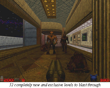
Enter Doom 64, the Doom that was finally something new. Maybe this was partly a result of circumstance (since the Nintendo 64 hardware wouldn’t have done such a great job of making Doom look like Doom in the first place), but in any case the result was something that any Doomer could appreciate. We now have 32 completely new and exclusive levels to blast through and revamped graphics to memorize frame by frame.

Complaining about Doom‘s (and, by extension, Doom 64‘s) simplicity is moot. Whiners who try to compare it to GoldenEye and the like are wasting their breath. Someone who knows what to appreciate in Doom has nothing to complain about in Doom 64, as the gameplay (thankfully) has not only been kept intact, but enhanced in almost all the right places.
Doom has a story, but it’s not the game’s strong point. You’d do just as well to make your own up. Doom 64 continues along a similar plotline to the previous sequels. “You thought you killed all the demons, but you didn’t, so go do it again.” Doom isn’t about a gripping story or intricate puzzles or memorable personalities; it’s about action. It’s the kind of game that we won’t be able to play when we get old and dull. Remember Space Invaders? Who was the main character? What was the most shocking plot twist? Which point in the game would you define as the most puzzling?
In Doom, you fight, and then you fight more. You fight a wide variety of monsters, each with its own strengths and vulnerabilities. You also have a vast range of weapons at your disposal, each fitting a certain situation (in my opinion, Doom‘s weapon balance has yet to be matched). Learning how to exploit the monsters’ weaknesses and the weapons’ diversity to build on-the-spot tactics for taking out a room of enemies is what the gameplay of Doom is made of. There are color-coded keys and doors, elevators, stairs, timing puzzles, exploding barrels, and many other similar additions to make things interesting, but the high point of Doom has always been killing and getting out alive. We Doom enthusiasts have a lust for high levels of difficulty and know (one wishes for a more forceful verb, such as, “have scratched into our minds”) more than anything the single rule of Doom action: “Keep moving and keep shooting.” Charming levels such as “Even Simpler” prove that Doom 64 keeps the tradition alive, and that the main focus of Doom is still combat.
Getting back to my original point, let’s examine the most obvious instance of newness in Doom 64—its look. The greatest graphical feature built into the N64 is its anti-aliasing. For the uninitiated, anti-aliasing is a process by which pixels are added in-between a game’s normally rendered pixels. The new pixels are a color blended of the two bordering pixels. The result is the appearance of a higher resolution, and many would say that it “blurs” or “smears” textures in this process. A good example of the result is (in a game with few textures in this case) Mario’s red cap against a blue sky in Mario 64. The normally jagged lines will now appear smoother. Midway has done a wonderful job with Doom 64 of utilizing this graphical feature (much better than with Doom 64‘s sister game, Hexen 64). The end result is something that (in some instances) almost looks like the “Killer Instinct Arcade Board in a Box” graphics that Nintendo originally tried to hype the Ultra 64’s as being. But make no mistake; while these graphics do make good use of the hardware’s strengths, they aren’t “N64-ish.” Doom 64 is dark and moody, and full of textures that actually look good anti-aliased because they were designed to be that way.
The sprites are a similar feat, having that 3D-rendered look while actually being 2D (think Mario Kart 64 or Killer Instinct Gold). They also do a good job of working with the anti-aliasing, rather than getting smeared by it. The enemies and objects have all been redone. From the tiny ammo clip to the fearsome Cyberdemon, every single sprite in this entire game has been re-rendered in glorious CGI fashion. The looks themselves have been significantly altered as well, so that each enemy has just enough resemblance to the original to give away who it is, but not so much as to make it a rehash.
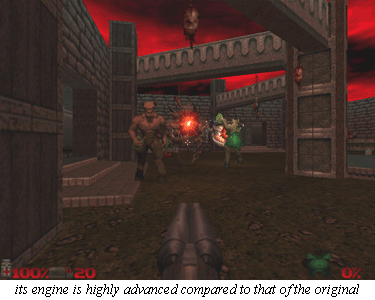
What all this amounts to is a darker and creepier Doom. The color is schematically a dark blue through most of the game, and the skies and walls as well stay in the range of brown to purple most of the time. Candles and torches light the way through most of the dark areas, and if you pay attention, you can see a nice, OpenGL-style glow of light on the walls (giving them a smooth, marble effect) based on which angle you are viewing them from, à la Quake 64.
As much as I like the soundtracks to the original Doom games, I don’t think that music of that type really capitalizes on the potentially scary atmosphere of the Doom franchise. With Doom 64, Midway wisely chose to lift the ambient soundtrack straight out of PlayStation Doom, right down to the individual tracks. Luckily, the ambiance translates perfectly into the N64’s MIDI-style audio architecture. Comprised mainly of moans, screams, clicks, gears, usually tempo-less and bass instruments, and even screaming children, Doom 64‘s “music” isn’t exactly melodic. Fortunately, it fits right in with the claustrophobic hallways and fire-and-brimstone-inspired locales of Doom. I recommend playing this game in a dark room with the sound up for the maximum atmospheric effect.
The sounds themselves were taken directly from the PlayStation version as well. As original as the graphics are, so are the sounds identical. And the PlayStation’s sounds are very similar to the original Doom sounds to begin with, so there’s not much new here. I suppose there was no reason to mess with a good thing, especially with so much monster rendering to do. Pump-action shotguns, hissing denizens of hell, and sliding space-station doors are all right on the money. I’ve never been to hell, but I would bet money that if any popular media comes close to sounding like it, Doom does.
Nothing has been altered for Doom 64‘s controls. You have nine buttons, a directional pad, and a control stick to move in four directions, strafe left or right, fire your weapon, activate doors and switches, access an overhead map of the level, and switch between weapons. The controls are fully customizable (hurrah!), so the choices are as great as your imagination. Taking the time to get used to the N64 control stick is worth the precision you gain by mastering it. All the buttons respond perfectly with no lag, and every move you’ve learned in any other port of Doom will work here with just a few minutes’ practice. (Allow me a quick note on the control stick. You will probably have trouble running exactly as fast with the control stick fully pressed as you can with the D-pad. An easy remedy to this minor setback is to push very slightly downward on your control stick (just enough so the character doesn’t move), and to reset the stick’s neutral position by holding R+L and pressing start. Your speed will increase just the right amount, but you won’t crawl forward automatically when you release the stick.) All in all, Doom‘s controls are solid and get the job done while taking full advantage of the controller’s strong points.
So at the end of the day, is Doom 64 really Doom, or is it just a knock-off that tries but doesn’t live up to its predecessor? Well, Doom 64 is definitely true to its heritage, and in spite of the temptations to change Doom‘s core to appease a more modern FPS audience, Midway has shown its faith in the original Doom by keeping everything important intact while buffing up a few spots worth buffing and adding a few new treats worth adding. So what exactly is different here? Following are some of the more glaring differences.
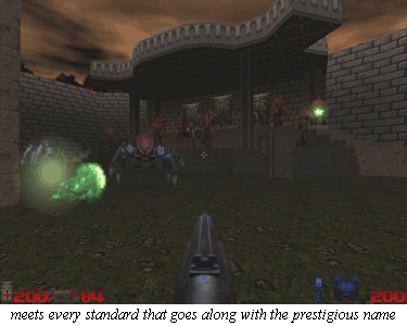
The engine for Doom 64 is highly advanced compared with that of the original Doom. It is more or less the Quake 64 engine, though I think the Doom 64 color palette is much more flattering to it here. First, this engine has fully implemented 3D. Whereas in traditional Doom, one object or sector couldn’t occupy the same X and Y space as another at a different height, in Doom 64, objects, enemies, and bridges can all pass over and under each other. Either because of limitations to this or to remain true to Doom style, Midway opted to reserve this feature rather than exploit it, but it is fully functional and adds to the gameplay in several instances, especially in letting you jump over enemies’ heads for a quick escape. Additionally, the lighting system has been dramatically improved upon. Now we can have colored light, simulated shining of light on walls, and even pits with pitch-black bottoms and fully lit ceilings (a particular achievement to those of you familiar with the original Doom’s lighting). The pulsing and flashing lights are all more dynamic and realistic than ever, and the sprites all flicker along in real time. The water now has double textures to give it more depth. The skies now have two levels as well.; there is a static part of the sky for things such as mountain ranges, and another level for clouds that scroll. As if that weren’t enough, the dark, purple sky in some levels flickers in sync with crashes of thunder.

The new levels themselves are gold. I have played hundreds of Doom levels, and I praise Doom 64‘s as some of the best I’ve ever seen. Thematically consistent, livable yet challenging, and technically flawless, they stand up even to id’s own masterpieces.
Also worthy of note is an elaborate scripting system that is very similar to that of Hexen. Now the designers are free to lead the player around in more interesting ways. For example, killing an enemy can now trigger anything from the appearance of a sought-after key to…another enemy! Items can appear and disappear in set patterns, or move out of reach just when you think you have them. The player can access a monitor and see into another room via a security camera. Darts fly from a wall as you approach it. Lost Souls have now become twice as fast, and twice as hard to deal with. The entire screen shakes when you fire the chaingun. (This is probably what the designers of force-feedback were trying to articulate, but this more simple approach works even better in my opinion.) You can even find kooky messages from the designers if you look. The list goes on and on…
In spite of all this, there are a few beloved enemies missing, but a new weapon and a new final boss make up for the loss. All things said, it’s Doom enough to be called Doom, and different enough to be called new. The balance between new and old is just right.
I don’t personally think Doom will ever get boring as long as there are new levels to play. The gameplay balance is just too brilliant. Doom 64 meets every standard that goes along with a name as prestigious as Doom, and it deserves its place among the originals of this classic franchise. On the other hand, while at no point is it questionable whether this is really Doom or not, Doom 64 packs enough originality that Midway can be proud of their “non-port” as a game apart from its cousins, a standalone masterpiece of pure action gaming, and one of the best third-party reasons to own a Nintendo 64.

