 THOU SHALT MAKE THY CONTROL SYSTEM LOGICAL AND FLEXIBLE
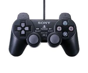
Firstly, a few ground rules — on every platform game EVER, the jump button should be in the same place. On a PS2, the X button. Placing the jump button ANYWHERE else in a platform intensive game is just plain stupid. Also, if a double jump skill is available it should be activated by two taps of the jump button. Not by pressing X then O. That’s appallingly asinine.
Similar rules apply for console FPS games, too. Anything other than the shoulder buttons to fire is moronic. Anything other than X the “use” button? Foolish. And anything other than the D-Pad for weapon changes? Farcical!
However, some developers STILL manage to ignore these fundamental laws of game design and lumber you with a control system so hideously abstract that it just feels WRONG to play. And then they commit the cardinal sin — no option to redefine the controller layout. WHY? This is a BLOODY EASY THING TO IMPLEMENT. The developers who fail to do this will burn in Hell. Your God has spoken.
